How to Balance Two Colors on a Card
October 12, 2018|Posted in: Creativity
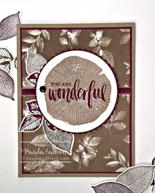
Balancing two colors can sometimes be harder than it sounds. Monochromatic is easy and multiple colors give you more options. With two colors, you seldom want a 50/50 balance. Here’s how I balanced the two colors in this card.
I love the Rooted in Nature stamp set, and I think the Nature’s Poem Designer Series Paper that goes with it is beautiful. The pattern with the brown leaves is my favorite of the designs. It’s soft, neutral and has a nice vintage feel to it.
TIP: Using the colors from a package of DSP is a simple way to get color inspiration.
That’s one of the reasons I chose Rich Razzleberry to pair with the browns. While there are two purples in the Nature’s Poem DSP package (Rich Razzleberry and Blackberry Bliss), I also had the lovely Rich Razzleberry velvet ribbon, so it was an easy decision as to which purple to use!
To start, I knew I wanted to use the DSP for a full background, and the tree trunk image as a background for the sentiment, plus some leaves for accent. The tree trunk is stamped in Crumb Cake ink on Whisper White card stock and cut with the Layering Circles Framelits. I opted for the larger circle as the next size down would have been very very tight around the image. But I used the smaller scallop circle for the mat. For this card I did not want bright colors but rather a soft, vintage feel, so I kept the purple to a minimum.
Next, I stamped several leaves, some in Rich Razzleberry and some in Soft Suede, with the Nature’s Roots Framelits. Then I played. I tried the ribbon vertically and horizontally. I tried various leaves in various spots around my circle. And with not too much trouble I settled on this placement.
This is where you stop and look at the balance, when you are designing. The purple ribbon, mat and leaves looked good, but concentrated in the middle of the card. So I trimmed the background DSP and added another layer with the purple card stock. The thin edge echos the the thin scallop mat and that was all I needed. A frame around the images. A subtle but balanced addition of color.
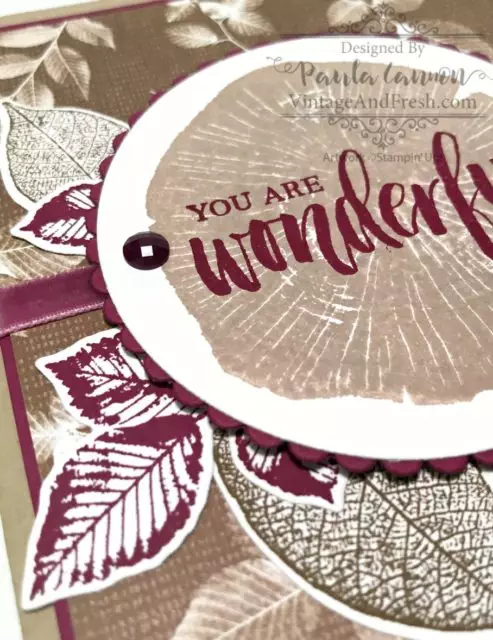
After gluing everything in place on a Crumb Cake card stock base, I added one more element – a gem (to ‘hold’ the leaves in place!) from the Faceted Dots.
I love how this card turned out, but I may be biased because I love the leaf paper. Now I challenge you to pick two colors and make a fabulous creation of your own!
Product List
Leave a Reply
*


