Viewing: faceted dots
August 9, 2019
The 2019 In Colors: Purple Posy
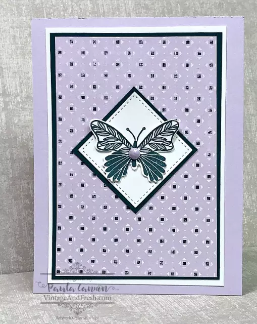
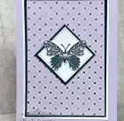
Purple Posy is the fifth of the five 2019-2021 In Colors. It’s a very light, soft color. If you are a fan of purples, this is the perfect addition to your color palette because it works so well with darker purples.
Once again I’ve gone to the Woven Threads designer series paper, not only for the color but for the design inspiration. Purple Posy is mixed in to several of the patterns on this paper package, but on this sheet it takes center stage. The square pattern is in Pretty Peacock, which at first glance may seem an odd pair, but it works.
Posted in Creativity | By Paula Cannon
July 12, 2019
The 2019 In Colors: Rococo Rose
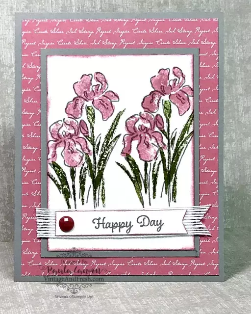
The new Stampin’ Up! Annual Catalog has been out about a month now and I want to start showcasing the new 2019 In Colors. Today’s card features Rococo Rose. Its a soft, subtle, dusty color of pink. I think it has a nice vintage appeal. I’m not a pink girl but its growing on me!
For my card, I started with a Gray Granite card base and a Rococo Rose sheet of designer series paper from the 2019-2021 In Color 6 x 6 pack. I choose the script pattern for a soft, feminine background.
For my stamping, I selected the Inspiring Iris stamp set. (more…)
Posted in Creativity | By Paula Cannon
October 30, 2018
Simple Tips to Step Up Your Card Design
Sometimes, all you want is a clean and simple card design. And sometimes you want to step up your design. Here are a few simple tips to do just that.
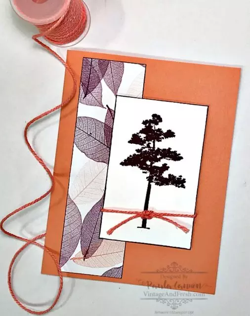
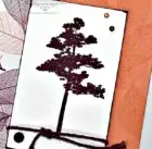
This is a clean and simple card design that I made for an open house event. The tree is from the Rooted in Nature stamp set and is stamped in Blackberry Bliss on Whisper White card stock. I lightly edged the card stock with ink, rather than add a mat. Do this by lightly swiping the edge of the paper across the ink pad. (Rooted in Nature is one of my favorite sets from the Annual Catalog. Here’s another card with this set.)
The card base is Grapefruit Grove. Both colors were chosen to match the piece of Nature’s Poem designer series paper, which is also lightly edged in ink. As an added touch, I added a twine knot. It’s a simple square knot. The piece is adhered to the card front with stampin’ dimensionals. It’s a simple design with unusual colors to draw interest.
Now, here is the stepped up version of this card.
Posted in Creativity, DIY | By Paula Cannon
October 12, 2018
How to Balance Two Colors on a Card
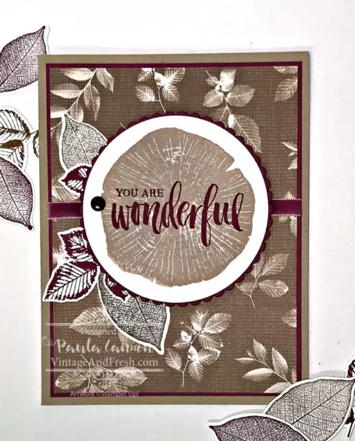
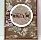
Balancing two colors can sometimes be harder than it sounds. Monochromatic is easy and multiple colors give you more options. With two colors, you seldom want a 50/50 balance. Here’s how I balanced the two colors in this card.
I love the Rooted in Nature stamp set, and I think the Nature’s Poem Designer Series Paper that goes with it is beautiful. The pattern with the brown leaves is my favorite of the designs. It’s soft, neutral and has a nice vintage feel to it.
TIP: Using the colors from a package of DSP is a simple way to get color inspiration.
That’s one of the reasons I chose Rich Razzleberry to pair with the browns. While there are two purples in the Nature’s Poem DSP package (Rich Razzleberry and Blackberry Bliss), I also had the lovely Rich Razzleberry velvet ribbon, so it was an easy decision as to which purple to use!
Posted in Creativity | By Paula Cannon
