Viewing: Layering Circle Framelits
May 24, 2019

How to Make Monochromatic Cards Interesting
Monochromatic, or one-color, cards don’t have to be dull or boring. In fact, with some simple touches they can be quite interesting. The first key is to use two or three shades of the same color, to bring in some variety. Then add a few elements to create design interest.
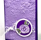
Today’s card has a monochromatic palette made with two shades of purple: the lighter shade is Highland Heather, and the darker is Gorgeous Grape. Now, this card is beautiful simply because I used the Country Floral embossing folder, but it will still be pretty with a different background!
Posted in Creativity | By Paula Cannon
October 12, 2018

How to Balance Two Colors on a Card
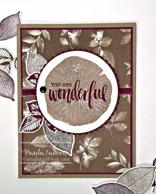
Balancing two colors can sometimes be harder than it sounds. Monochromatic is easy and multiple colors give you more options. With two colors, you seldom want a 50/50 balance. Here’s how I balanced the two colors in this card.
I love the Rooted in Nature stamp set, and I think the Nature’s Poem Designer Series Paper that goes with it is beautiful. The pattern with the brown leaves is my favorite of the designs. It’s soft, neutral and has a nice vintage feel to it.
TIP: Using the colors from a package of DSP is a simple way to get color inspiration.
That’s one of the reasons I chose Rich Razzleberry to pair with the browns. While there are two purples in the Nature’s Poem DSP package (Rich Razzleberry and Blackberry Bliss), I also had the lovely Rich Razzleberry velvet ribbon, so it was an easy decision as to which purple to use!
Posted in Creativity | By Paula Cannon
